Here are some comparison
shots between Chex Quest Phase I and the work currently in progress:
(Warning: Lots
of Graphics = Slow Page Load)

Here is the diner (E2M1) with its
sprites based stools.

Here is the Phase II diner with
its 3D sector based stools, and a tile floor.
(Please note the box of Rice Chex
at the far end of the counter)
The counter top has also been built
out using one of Legacy's 3D sectors.

The walls of the diner were so thick,
that I was able to add booth seating.
<<EDIT (February 5, '04): I've
switched the old pic for a new one showing the new textures for the booths,
and the new windows (with translucent textures for glass). Outer
walls have been constructed for the hangar outside, which can also be seen.
There is no new flat for the tops of the seats yet in this shot.
The upholstery on the seats may have to be changed to dark grey in order
to match the stools.>>

The hangar (E1M1)

The changes made here for phase II are
subtle. I have built out the baseboards at the bottoms of the walls,
and the siding at the tops of the walls. There are even 3D sectors
up there. It doesn't look much different, but does increase the feeling
of depth. That funny pale line at the bottom of the baseboard is actually
Legacy's openGL mode attempting to anti alias the bottom of the texture
with the top of itself. The Legacy team is working to fix the problem.

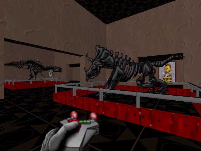
Some slight changes to the Art Gallery
level (E2M3). More paintings, fossils, and signage will be added
in the near future.

Eat your Chex!


Switching the original Chex Quest levels
over from the original DooM engine to DooM Legacy created some slight problems
in the laboratory level (E1M3). The Legacy team has given some of the DooM
items partial transparency, and given coronae (plural of corona) to others.
Unfortunately, these changes do not benefit the Chex Quest items that happen
to replace DooM items that either glow, or have become see through.
On the left, you can see two victims of this problem. Personally,
I would tend to avoid flasks that are glowing, and although the transparency
looks good on the liquid in the beaker, the transparency on the Bunsen
burner is just plain wrong.
On the right, you can see that I
have changed the flask to a non glowing item, and the beaker with Bunsen
burner is now two different things. One thing is the original translucent
item, which gives us the liquid, an the other thing is is opaque, for the
Bunsen burner and the outline of the beaker. The second thing also
has dynamic lighting that simulates the light cast from the burner's flame.

Every time I enter the Museum level
(E1M3 of Chex Quest 2 / E2M3 of TUCQ) I cannot help but ask myself two
things: 1.) How the heck did I get into this small enclosed courtyard?
Did I fly? and 2.) If the museum is so tall that I have to
run up three flights of stairs to reach the main gallery, and that gallery
is itself over two stories tall, why in heaven's name can't I see it from
this one story courtyard?
Something is definitely wrong here.

Ah! There is is!
I opened up the area around the courtyard,
and built a way in Presumably, the player got in via the gate on
the one side of the courtyard, which has, unfortunately, locked behind
him, forcing him to play through the level, instead of running away down
the boulevard like a coward.
Although it does not have any textures
yet, I have constructed the outside wall of the museum. It is meant
to take on the look of a 19th century museum, hence the large cornice on
the roof line. The outer wall is only 24 pixels taller than the ceiling
height of the main gallery, which merely accounts for the thickness of
the roof, so this really is how tall the museum is supposed to be.

Another shot of the original version
of the courtyard. The texture for the wall does not tile well. You
can easily see a line of demarcation where one side of the texture ends
and the other begins. The narrow texture also repeats too much.
Also, since the player starts next
to that very wall, one really has to ask how the heck he got there.

In the phase II version, the east wall
of the courtyard has been opened up, with a boulevard extending away. To
keep game play the same, the way out has been blocked by a gate (There
no texture for it yet), which has been made up out of Standard DooM lowers,
plus Legacy's 3D sectors. The texture for the walls has been extended
from 64 pixels wide to 256 pixels wide, and repainted so as to make it
tile better, and reduce the frequent repetition. The bases and crowns
of the walls have been built out, as they were in E1M1 (see above).
It may be subtle, but it adds a lot of extra depth to the scene.

Here is the stairway leading up to the
main gallery of the museum. It's so plain, isn't it. The height of
the ceilings are kind of low at the top each flight of steps too.
Don't bump your head!
BTW: That ugly red ceiling
has got to go!

The ceiling height has been raised,
the red ceiling has been replaced with a tan stucco ceiling that goes better
with the walls, and some sconced lighting fixtures have been added, which
actually cast light in openGL mode, for a much warmer and brighter look.
BTW: Please note that I have
changed Legacy's HUD icons for armour and ammo to more Chex appropriate
icons.

Some girders for internal structure,
and some corrugated steel textures, make the hangars on E2M1 look
a lot more like real hangars.
Just a few trusses along the ceiling,
some lights, and a better looking set of flats for the floor, and this
baby ought to be looking real good!

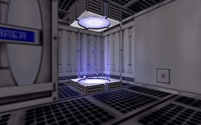
An improved version of the teleporters
on E1M2. The pads are recessed into the platforms, and a Heretic style
rising glitter effect has been added.

A non-functioning teleporter.
The player starts here on E1M2.

These storage cabinets have been
built out from the wall using Legacy's 3D sectors, giving them more depth
than they had as just flat wall textures. For comparison, please
note the glass cabinet towards the right of the picture, which has not
been built out yet.

One of the rooms on E1M3 with some
rather unconvincing looking tables, and glowing flasks.

The same room in its current state
for phase II.

The largest landing bay (Bay 1) before
alteration. This bay is sunken down below the level of the rest of
the structures in this level, but does not compensate for the change in
height along its north and west walls. A problem with this is that
it means the adjoining structures are taller on the inside than they are
on the outside. Not only can you not do this in real life, due to
those darned laws of physics, but you can't due it in DooM Legacy either,
because of the Legacy's openGL ceiling "bug". If you look above the
door, and the observation window, you can see the ceilings of those adjacent
structures floating mysteriously in the sky. Not good.
Also note the flat used for the floors
in this level. The flat fades towards its edge, and doesn't tile
very well. I have heard this flat referred to as the "mouldy carpet"
flat by a few people, because the overall look it gives it the appearance
of a piece of old worn out carpet.

Bay 1 after alteration. The
heights of the walls on the north and west sides have been raised in order
to agree with the size of the adjacent structures. Additional walls
have been build around other sections of the map that might possibly trigger
the ceiling "bug". The crowns and bases have been built out, just
as they have been throughout this level, although it may be difficult to
see the difference at this distance. The size of the observation
window has been increased, and the flat has been edited so that it tiles
better, and no longer has that "mouldy carpet" look. This section
of E1M1 was probably the most difficult area I have had to edit for TUCQ
so far, due to the complexities of setting up the sectors in the regions
where shorter and taller walls meet.

Me and a couple of bots go for a
swim on E1M3.

A 3D hydraulic lift on E2M1. A 3D
sector based switch box that lowers the lift is to its right. Another
switch box, also made out of 3D sectors is perched atop the lift platform
itself

Another view of the lift, lowered
this time.

The Arboretum on E1M4. With
no sunlight and no electrical lights in this room, how do these trees manage
to grow?

The phase II version of the arboretum
is set up as a greenhouse. Now we know where the trees get their
sunlight from. The glass is simulated with Legacy's translucent texture
line type for the wall, and a translucent 3D sector for the ceiling.
The pond now has a sloping bottom,
and 3D water inside. Some lilies are growing in the water at the
edge of the pond.
There are approximately 800 lindefs
showing in this screen shot, as opposed to 30 or 40 in the older version.

Here is another improvement to the
look of the teleporters. The bad news is that it can only be seen
in opengl mode.

DooM Legacy allows for flats that
are larger than the standard 64 × 64 pixel flats used by DooM.
I used this feature extensively
in E1M3 to create matching ceilings for the "steel plate" motif used throughout
the level.
Twenty-eight 128 × 128 pixel
flats were created for this job.

All the pick up messages, death
messages, and exit messages , save one I liked, have been changed from
their
original DooMish versions to the
appropriate Chex Quest versions. This is the first time anyone has
ever
successfully changed the Legacy
Death messages (i.e. Boingo was shot by a possessed, Boingo was fried by
an
imp) or the exit messages (Don't
leave -- there's more demons to toast!) to something else.


